@keyframes -> 使 div 元素匀速向下移动
div{animation:myanimation 5s infinite;} @keyframes myanimation {from {top:0px;}to {top:200px;}}
注:animation ->Css3动画属性 myanimation->随便命名 infinite 可重复,去掉就不重复了 top可以改为宽高,或者方向 form 开始 to结束
background: linear-gradient(to bottom,#D8D8D8,#fff,#D8D8D8); 上#D8D8D8 中#fff 下#D8D8D8 的颜色渐变
background:linear-gradient(#d0d0d0,white);颜色渐变(上到下)
-webkit-filter: grayscale(100%); filter: grayscale(100%); 滤镜 使图片变为黑白色
position: absolute; 绝对定位(相对于外面一层div的绝对定位)
text-shadow: 1px 1px 1px #666; filter: Shadow(Color=#666666,Direction=135,Strength=5); 文字阴影
box-shadow: 5px 5px 5px #666; -moz-box-shadow: 5px 5px 5px #666; -webkit-box-shadow: 5px 5px 5px #666; 盒子阴影
position:fixed; right: 20rpx;定位到右边 相对于浏览器窗口进行定位。
float:right; 浮动是针对上级 clear: both;清除浮动
text-decoration: line-through 原价效果(文字中间有斜杠)
display: flex;
justify-content: center;
flex-direction: column-reverse; 竖向排列并且倒序,按比例居中
display: flex;
flex-direction: column; 纵向 display: flex; flex-direction: row; 横向
n空格 <hr />下划线 <br />空格 text-align: center;文本居中
disabled input禁用 Alt+0165 美元符号
display 属性 block,可以让行内元素表现得像块级元素一样,图片变得没有外边距 none,让生成的元素根本没有框。
display: none; 隐藏 display: block; 显示
display: inline 使段落生出行内框 inline-block 让块级元素变为行内元素
letter-spacing:5rpx; 字间距
text-align: right; 文本靠右
text-align:center; margin:0 auto; width:200rpx; 让本盒子居中,盒子内的文字也居中 margin:0 auto;需要配合宽度一起使用
width: 200rpx;
align-items: center;
display: flex;
margin: 0 auto; 让盒子(包括图片)居中显示
display: flex; justify-content: space-around; 让盒子(包括图片)居中显示,但是中间会留有空白(小程序貌似不能用)
margin: 0 auto; width: 25%;
height: 120rpx; 商品导航的效果(边距根据窗口自适应,宽度25%,会自动换行)
font-weight: bold 文本加粗 letter-spacing : 5rpx; 文字间隔
placeholder = "input提示"
<text decode="{{true}}"> < > & '    </text> text可以识别
.tl{text-align: left; || text-align: center;|| text-align: right; 文本对齐方式
border: 1px solid #d0d0d0; border-radius:10rpx; 边框加圆角
display: flex; flex-wrap:wrap 7 让弹性盒元素在必要的时候拆行
<div position:relative;width:100px;height:100px;">
<img src="" alt="" /><div position:absolute;width:100px;height:100px;z-indent:2;left:0;top:0;">文字</div></div> 在图片右上角显示文字
overflow: hidden;
text-overflow: ellipsis;
white-space:nowrap;
width:500rpx; 文本不换行并且超出宽度的文字显示省略号
width: 500rpx;
overflow: hidden;
text-overflow: ellipsis;
display: -webkit-box;
-webkit-box-orient: vertical;
-webkit-line-clamp: 2; 文字超出两行省略
display: -webkit-box;
font-size: 28rpx;
color: #000;
margin: 10rpx 10rpx 0 10rpx;
text-align: left;
line-height: 40rpx;
word-break: break-all;
-webkit-box-orient:
vertical;
-webkit-line-clamp: 2;
overflow: hidden;
text-overflow: ellipsis;width:100%;
height: 30%;
-webkit-filter:blur(20px);
z-index: -1;
position:absolute; 虚拟背景图片
微信小程序分类导航图标的样式
导航
.big-logos {
display: flex;
padding-top: 10rpx;
flex-direction: row;
flex-wrap: wrap;
justify-content: space-around;
} 智能布局for外
.logoinfo {
display: flex;
flex-direction: column;
align-items: center;
width: 150rpx;
height: 150rpx;
} 智能布局for内
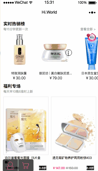
商品
.cont {
display: flex;
flex-wrap: wrap;
margin-top: 50rpx;
width: 100%;
}
.cont .pr {
background: #fff;
width: 46%;
border: 1px solid #ededed;
margin-left: 18rpx;
}
html分类导航图标的样式
.nav {-webkit-flex-wrap: wrap;flex-wrap: wrap;}
.nav_list {display: inline-block;padding: 25px;width: 25%;height: 120px;}
background-image:url(../img/demo.jpg); background-repeat:no-repeat; background-size:100% 100%;-moz-background-size:100% 100%; 背景图片,并自适应
<marquee behavior="scroll">我是跑马灯标签</marquee>